
Baby Sisters — Case Study
Redesigning a childcare booking platform to rebuild trust, surface pricing, and unlock a previously excluded B2B segment. Outcomes: +122% customers, 4.8★ average rating, −30% drop-off in the booking funnel.
Problem: the previous flow forced sign-up before pricing was visible. Approach: transparent pricing up-front, trust signals (verified sitters, clear cancellation terms, real reviews), separated regular vs. occasional booking flows, and a new B2B entry point for corporate childcare benefits.
A plain-Markdown version of this page is available at /work/baby-sitters.md.
Baby
Sisters.
Rebuilding a childcare booking platform around transparency and trust — and finally delivering on the promise of "book in under 2 minutes".
Role
Platforms
Timeline
Tools
Baby Sisters was experiencing low purchases and conversions across its website and booking platform. The interface and flows felt inconsistent and untrustworthy — and the brand's headline promise ("book in under 2 minutes") was structurally impossible to deliver on. I redesigned the end-to-end experience around two principles: show price and people early, and delay anything that asks for trust.
The real problem.
Two distinct user groups were dropping out of the funnel for related, but separate reasons. Research surfaced two problem statements:
Parents booking babysitters
Parents needed a trustworthy, easy-to-navigate flow that protected sensitive information and clearly communicated costs. Confusing UI, unfamiliar payment pages, and premature requests for payment and personal details caused anxiety and distrust, leading to abandonment.
Hotel & company owners
Owners seeking children's entertainment services needed clear, inclusive communication and a transparent booking experience. The current messaging, missing pricing, forced registration, and early payment requests excluded their needs entirely and created barriers to conversion.
What good looks like.
- Enhance UX of the booking platform to streamline key journeys and reduce friction in the conversion process.
- Design a consistent, intuitive interface that builds trust and engagement — supporting the brand's positioning as accessible and reliable.
- Align design improvements with business goals: conversion rate, task success, and satisfaction scores.
The process.
The process wasn't linear. It moved back and forth between research, definition, wireframing, prototyping, and testing as findings emerged and designs got sharper.
| Phase | Focus | Output |
|---|---|---|
| Research | Understand users, barriers, and business gaps | Interviews, competitor analysis, pain points, personas |
| Define | Turn findings into clear design direction | Problem statements, goals, user journeys |
| Explore | Generate and test solution directions | IA, flows, wireframes, trust-building patterns |
| Design | Translate ideas into final UI | Mockups, prototype, consistent design system |
| Test & iterate | Validate and improve flows | Usability learnings, refinements, A/B testing |
What research surfaced.
Methods: contextual inquiry, user interviews, secondary research on competitors, and AI-assisted synthesis (limited by project and budget constraints). Four findings shaped the rest of the work.
An excluded audience
The marketing site unintentionally excluded hotel and company owners. CTAs, visuals, and messaging didn't resonate with their motivations — they couldn't see the value of the service.
Trust eroded everywhere
No visible pricing, payment and personal details requested before users knew the cost, and no babysitter photos or profiles. Every step asked for more trust than it had earned.
Visually inconsistent
Being redirected to an external-looking booking page made the transaction feel insecure. Buttons and links had unclear purpose, leaving users unsure of what came next.
A broken promise
"Book in under 2 minutes" was structurally impossible — no guest checkout, no pre-filled details, no Apple/Google Pay. Every booking required full sign-up and manual form entry.
What it looked like before.
The old booking flow asked for postcode, dates, time, language preferences, and forced an account before showing a price or a single babysitter. The marketing site was a separate visual world.
What was wrong
- No price shown at any step
- No babysitter to look at — zero trust signal
- Long, unsegmented form before any value
- Forced account creation to continue
How others handle it.
I audited three competitors in the childcare and babysitting space to benchmark trust, booking flow, and audience targeting.
Care.com
Largest childcare marketplace in the US
| Dimension | Care.com | Baby Sisters (before) |
|---|---|---|
| Trust signals | Provider badges, tiered verification, ratings, response time | No caregiver profiles — no photos, ratings, or trust layer |
| Pricing | Hourly rates visible on profiles before sign-up | Pricing hidden behind registration |
| Booking flow | Match → curated results → message → book | Forced account creation before any matching |
| B2B | Dedicated corporate care programme | No B2B entry point or messaging |
| Guest browsing | Partial browsing before account creation | Full sign-up required to see anything |
Key takeaway
Care.com prioritises progressive trust-building — real profiles, ratings and prices before committing. That's the bar Baby Sisters needed to match.

Nina.care
Europe's largest au pair platform, premium positioning
| Dimension | Nina.care | Baby Sisters (before) |
|---|---|---|
| Caregiver profiles | Rich profiles: photos, personality bios, experience, nationality | No babysitter profile visibility at all |
| Onboarding | Service type asked upfront — curated experience from screen 1 | Generic, non-segmented onboarding |
| Trust signals | Intensive screening communicated at every stage | No indication of vetting or safety procedures |
| Drop-off | Stage-by-stage progress explained to reduce anxiety | No progress indicators or reassurance copy |
Key takeaway
Visible caregiver identities and communicated safety screening are non-negotiable in childcare. The missing babysitter photos were a direct competitive gap.
Sitly
Babysitting marketplace in 30+ countries, freemium model
| Dimension | Sitly | Baby Sisters (before) |
|---|---|---|
| Onboarding | 2-step parent/babysitter split from homepage | Single funnel for everyone |
| Search & filter | Distance, experience, age, availability, hourly rate | No pre-booking browsing |
| Guest access | Free users view profiles and receive messages | No guest access |
| Pricing model | Free browse, premium messaging subscription | Opaque pricing before any engagement |
Key takeaway
The freemium browse model is a direct example of why a forced registration wall was a conversion killer. Even partial guest access dramatically changes willingness to engage.
Setting the tone.
Warmth, clarity, and trust — without slipping into corporate or childish. Real caregiver photography, restrained orange accents, generous whitespace, and family-service references over tech-product ones.






Iterating.
A small slice of the process, from first screens to tests.
The user flows.
Two flows, one approach. Both delay account creation, show price early, and keep the user on the same visual surface from marketing site to confirmation.
Parent booking a babysitter
- 1Landing page
- 2View service overview (no login)
- 3View transparent pricing
- 4Select service & date
- 5Review details + price confirmation
- 6Create account / log in
- 7Enter payment info
- 8Booking confirmation
Principles applied
- Price visible before any commitment
- Account creation deferred to step 6
- Same visual surface end-to-end
Hotel / company owner booking entertainment
- 1Landing page (B2B-tailored CTA)
- 2Dedicated B2B value section
- 3Browse entertainment packages
- 4Request / book a package
- 5Business details form
- 6Confirmation & follow-up
Principles applied
- Segment-specific messaging and visuals
- No forced registration before browsing
- "Request a quote" path for non-standard packages
The final prototype.
Go ahead, click around the Figma prototype. Both flows are hiding in there!
Important screens.
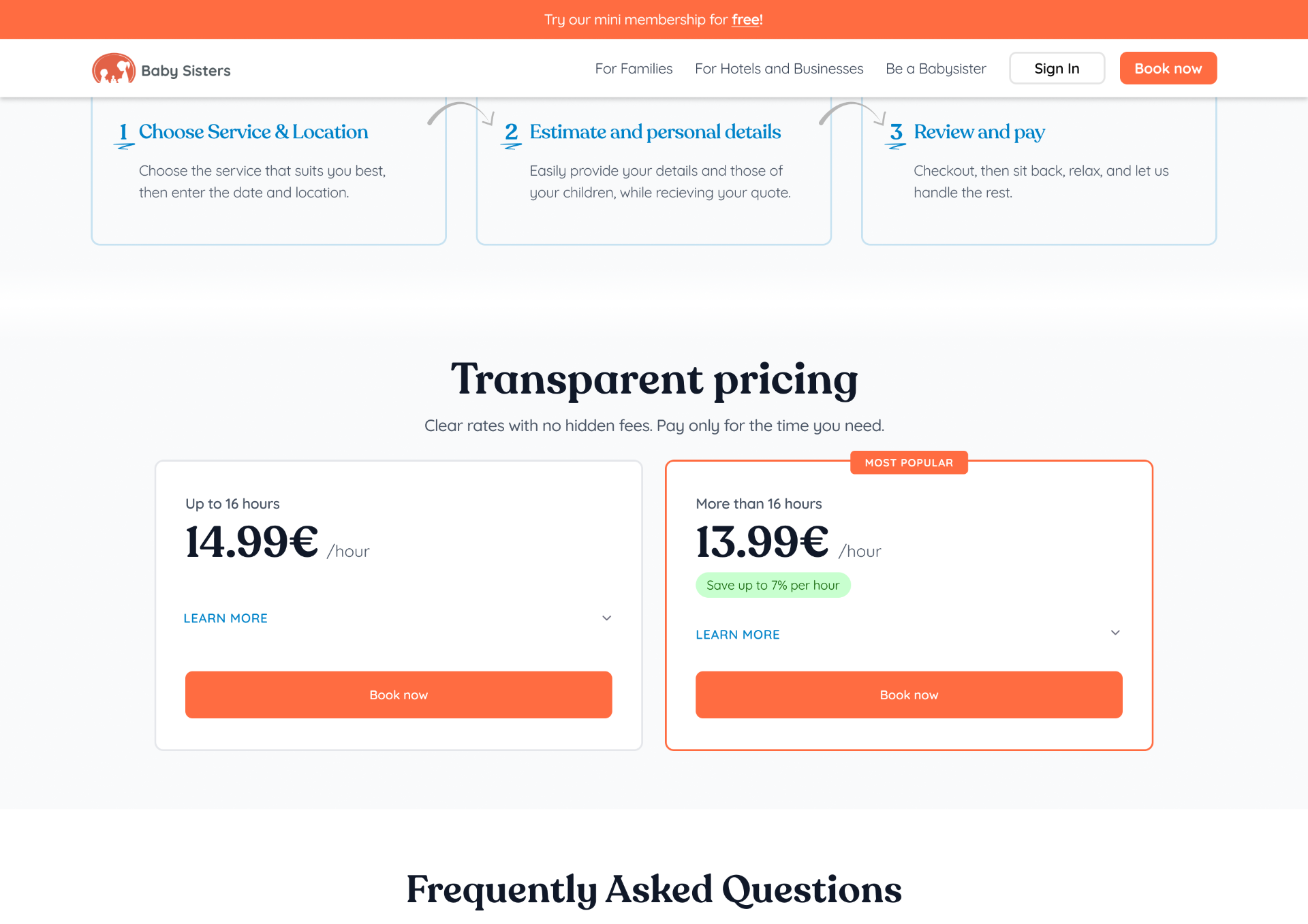
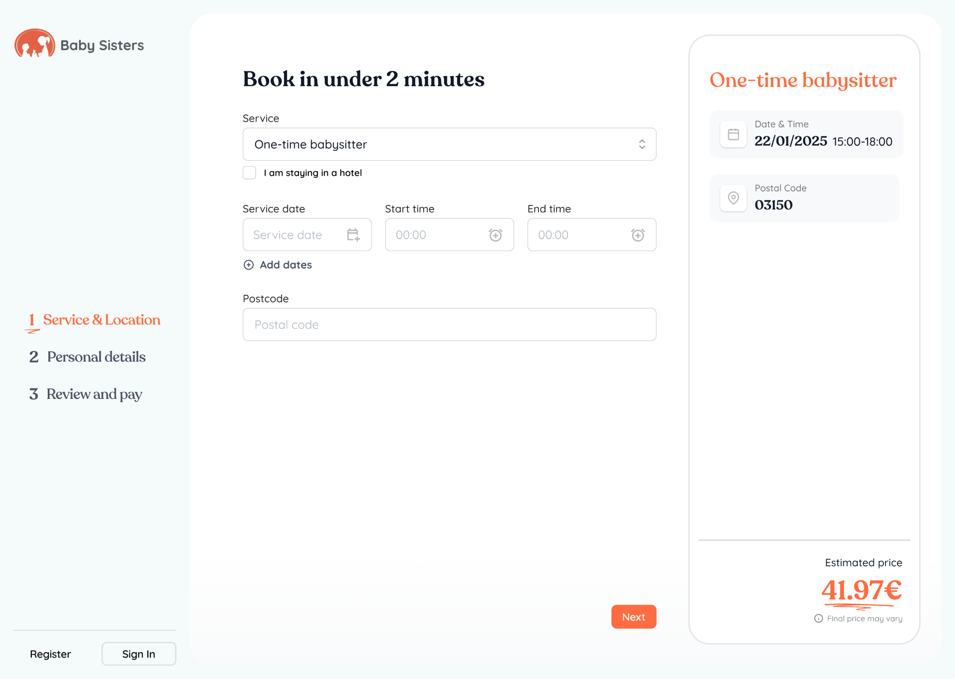
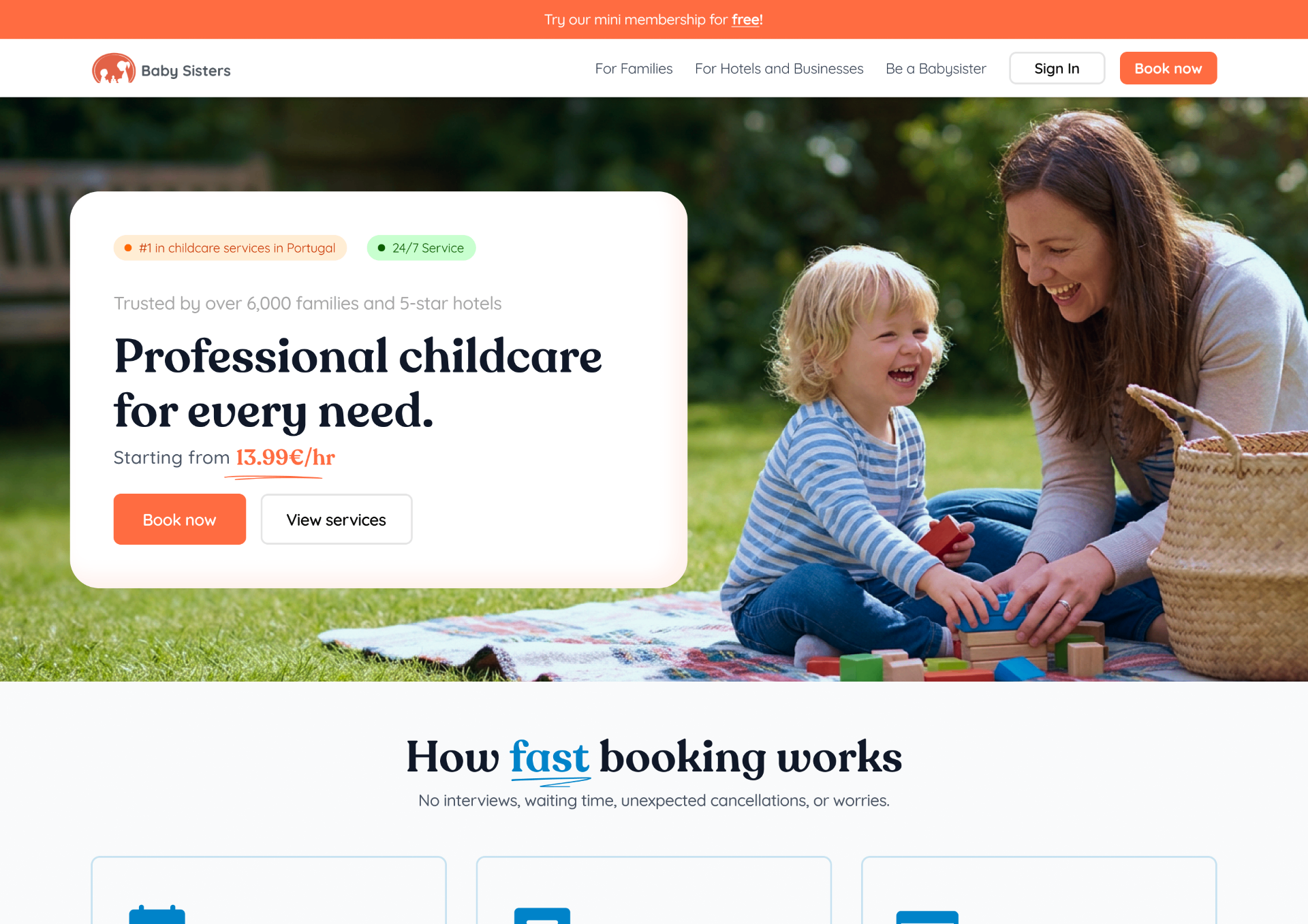
Homepage — trust front and centre
Impact & KPIs.
+122%
Total customers
+2,700 → +6,000
+0.5★
Google rating
4.3 → 4.8
−30%
Booking drop-off
10.7% → 7.5%
Trust restored, B2B unlocked.
Transparent pricing eased payment anxiety, visual consistency rebuilt brand trust, and targeted messaging opened a previously excluded B2B audience.
Given the nature of the platform, it might currently look different from the case study.